


Smartphones have gradually evolved from being simple communication devices into deeply personal accessories that accompany people through almost every part of their daily lives. For many users today, choosing a phone is no longer determined solely by processor performance, camera capabilities, battery capacity or storage. Design matters. The way a device looks in the hand, feels during everyday use and complements a person’s individual style has become an increasingly important part of the smartphone experience.
That changing attitude towards mobile technology is reflected in the Infinix SMART 20, a device that appears designed to appeal not only to users looking for practical technology but also to those who want a smartphone that reflects their personality.
Rather than treating colour as a minor finishing detail, the SMART 20 lineup gives users several distinct visual identities to choose from. Its colour options range from vibrant and youthful to understated and sophisticated, creating the impression that there is a version for almost every mood, fashion preference and lifestyle.
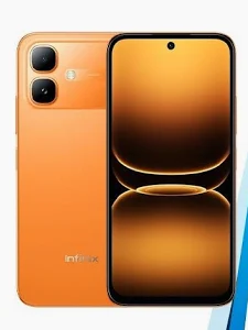
For users who enjoy expressive technology, Sunlike Orange immediately stands apart.

The colour carries an energetic and youthful character that naturally attracts attention. It is the kind of finish designed for people who are comfortable allowing their accessories to become part of their personal style. In a world where smartphones regularly appear in photographs, videos, social media posts, classrooms, offices and public spaces, a distinctive colour can give a device considerably more personality.
Sunlike Orange fits naturally into that space.
Its vibrant appearance can appeal to young users who enjoy colourful fashion, social media aesthetics and accessories that stand out without requiring additional decoration. Whether the phone is being used during a casual outing with friends, placed on a desk during a class or brought into a content-creation environment, the orange finish gives the device an unmistakably lively character.
It is bold without being complicated, youthful without appearing immature and expressive enough to make the phone immediately recognisable.
For consumers who prefer something calmer and more refined, however, Cloudline Blue offers an entirely different experience.
Where Sunlike Orange makes its presence known, Cloudline Blue takes a quieter approach. The cool-toned finish creates a polished and sophisticated appearance, giving the smartphone an understated quality that can work across a wide variety of environments.
Cloudline Blue is particularly suited to users who want their smartphone to look fashionable while maintaining a mature appearance. It can fit comfortably into a student’s daily routine, a young professional’s working environment or the lifestyle of someone who simply prefers cool, elegant colours.
There is also something timeless about blue as a smartphone colour. It can feel contemporary without being overly experimental, allowing the SMART 20 to maintain a modern appearance while avoiding the impression of following a temporary trend.
Then comes Polaris Titanium, which introduces another personality altogether.
The silver-toned finish gives the SMART 20 a distinctly modern and futuristic character. Its clean appearance creates an association with minimalist technology and premium-looking devices, making it an attractive choice for users who prefer a more sophisticated aesthetic.
Polaris Titanium can easily move between different settings. It does not look out of place in a professional environment, yet it can equally complement a casual lifestyle, school setting, social gathering or content-creation desk.
That versatility is one of its strongest visual qualities.
Instead of demanding attention through colour intensity, Polaris Titanium creates its appeal through simplicity. Its reflective appearance interacts with light to produce a sleek finish that can make the device look polished from different angles. For someone who prefers technology that looks contemporary, clean and restrained, this version could naturally become the preferred choice.
Then there is Shadow Black, a colour that demonstrates why classic design never really disappears.
Black has remained one of the most dependable choices across generations of consumer electronics because it works with almost everything. It can look professional, powerful, understated and sophisticated at the same time.
The Shadow Black version of the SMART 20 follows that familiar philosophy. Its darker appearance gives the phone a sense of quiet confidence, avoiding unnecessary visual distractions while maintaining a premium-looking presence.
For users who prefer a device that can move effortlessly between professional and casual environments, Shadow Black offers that flexibility. It is the kind of colour that can complement almost any outfit, workspace or accessory, making it a practical choice for people who value simplicity and longevity in design.
According to DDM News, however, the appeal of the SMART 20 is not limited to the colour palette. The physical design also plays an important role in determining how the phone feels as an everyday companion.
The two-tone design contributes to this visual identity by combining different surface treatments across the body. The matte textured finish creates a more restrained appearance, while the glossy camera area introduces contrast and gives the rear panel additional visual depth.
It is a relatively subtle design decision, but one that helps prevent the smartphone from looking flat or generic.
The slim profile adds another dimension to the experience.
At approximately 7.7mm, the SMART 20 is designed to maintain a relatively slim and comfortable form factor. This matters because smartphones are no longer devices that people use for only a few minutes at a time. Many users spend hours scrolling through social media, watching videos, communicating with friends, attending online classes, browsing the internet, playing games and managing everyday tasks from their phones.
A device that remains comfortable in the hand during extended use can therefore make a meaningful difference to the overall experience.
The SMART 20’s lightweight and slim design contributes to that sense of everyday convenience. Instead of feeling unnecessarily bulky, the phone is intended to sit naturally in the hand, making activities such as messaging, browsing and video consumption easier to manage over longer periods.
The emphasis on everyday practicality also extends beyond appearance.
The device’s IP64 rating provides a degree of protection against dust and water splashes, adding another layer of reassurance for users who carry their smartphones through different environments. Accidental exposure to splashes can happen during everyday activities, and having additional resistance can provide peace of mind.
Its stated 1.5-metre drop resistance is another practical feature aimed at the realities of daily smartphone ownership. Phones can slip from desks, beds, pockets and hands, and while no device should be considered indestructible, additional protection against accidental drops can be reassuring.
This combination of visual design and practical considerations helps explain why the SMART 20 stands out as more than a conversation about colours.
Smartphone design has become increasingly connected to identity. People carry their phones into meetings, classrooms, restaurants, social events and family gatherings. They photograph them for social media, use them as part of their content-creation setups and often keep them within reach throughout the day.
As a result, the device becomes an extension of personal style.
That is where the SMART 20’s range of colour options becomes particularly interesting. Instead of presenting users with finishes that feel almost identical, the lineup allows them to make a more personal decision based on the kind of visual statement they want their smartphone to make.
Someone who wants energy and attention may gravitate towards Sunlike Orange. A user looking for calm sophistication may prefer Cloudline Blue. Those attracted to a futuristic and minimalist appearance may choose Polaris Titanium, while consumers who value timeless simplicity can opt for Shadow Black.
DDM News observes that this approach reflects a broader change in how consumers relate to smartphones. Specifications remain important, but design, comfort and personal expression are increasingly becoming part of the purchasing decision.
The result is a smartphone lineup that attempts to accommodate different personalities rather than assuming every consumer wants the same visual experience.
Ultimately, the Infinix SMART 20’s appeal lies in that combination of expression and practicality. Its colour options provide users with the freedom to choose a personality for their device, while its slim form, textured body, contrasting camera design and durability-focused features are intended to make that choice useful beyond aesthetics.
From the unmistakable energy of Sunlike Orange to the refined character of Cloudline Blue, the futuristic simplicity of Polaris Titanium and the timeless confidence of Shadow Black, each version tells a slightly different story.
And perhaps that is the strongest message behind the SMART 20 lineup: a smartphone does not have to look the same for everyone.
In an increasingly personalised digital world, technology can be functional while still reflecting individuality. The SMART 20 embraces that idea by giving users something increasingly valuable in consumer electronics , the freedom to choose a device that does not merely fit their needs, but also feels like it belongs to them.