")

A major leak reveals new Google app icons for Gmail, Drive, and Chat. These vibrant redesigns highlight upcoming AI integrations across the software platform.
A massive leak recently exposed new designs for thirteen popular Google app icons. Specifically, the technology giant will update daily tools like Gmail, Drive, and Chat to highlight new artificial intelligence features. Furthermore, this major visual update embraces a brighter, minimalist style for the entire software platform. Next, this article will explore the specific changes coming to these famous digital tools.
A Fresh Look for Workspace Tools
Late last year, Google updated the icons for Google Maps and Google Photos. Shortly after, a new leak revealed that thirteen other applications will follow suit. Also, sources shared this exciting information directly with the technology news website 9to5Google. Consequently, users caught an early glimpse of the upcoming visual overhaul.
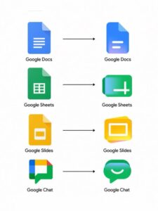
Specifically, the leak showcases changes for Calendar, Docs, Sheets, and Slides. Furthermore, the leak includes Keep, Meet, Forms, Sites, Tasks, and Google Voice. In other words, almost the entire digital workspace will look quite different very soon. Overall, these new designs embrace a minimalist approach while using brighter colors.

Significant Changes to Popular Apps
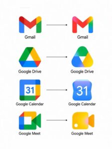
Meanwhile, the leaked images reveal very distinct changes for several core applications. To put it simply, the Google Drive logo will lose its classic red accent. As a result, the new Drive icon only features green, blue, and yellow. At the same time, the Google Chat icon receives the most dramatic visual makeover. Specifically, it changes from a four-color bubble into a rounded, green smiling face.
On the other hand, Google Meet and Google Calendar will use fewer colors. This means that they abandon their complex multi-colored looks for simpler designs. Besides that, the document creation tools also receive notable updates. Specifically, Docs, Sheets, and Slides maintain their familiar primary colors. However, developers rotated the Sheets and Slides icons into a landscape layout. That is to say, they now match how people naturally view spreadsheets.
The Subtle Update for Gmail Users
Nevertheless, some applications will receive very light adjustments instead of complete visual makeovers. Specifically, the famous Gmail envelope icon retains its traditional shape and colors. Even so, the new design introduces a smooth color transition. For example, the left side starts completely red before blending into yellow. Following this, the color gently shifts into green and ends in blue.
As a result, the new icon looks much more like a physical paper letter. Furthermore, this subtle gradient style connects Gmail to the broader design language. In addition, these soft color blends replace the sharp lines of older icons. This shows that Google wants a unified look across its entire software ecosystem.
The Strong Push for AI Integration
At the same time, many users might wonder why Google decided to change these famous icons now. To clarify, the redesign carries a very specific, strategic purpose. Specifically, the bright gradients visually represent new artificial intelligence tools. In other words, the fresh colors show that these apps feature smart integrations.
Because of this, the icons serve as a visual signal for advanced software capabilities. Furthermore, Google recently expanded its Gemini artificial intelligence platform rapidly. Consequently, the company wants users to notice the smart tools hidden inside everyday apps. As a result, experts noticed the visual shift immediately.
“The new logos are more minimalist and brighter.” James Peckham, Reporter
Ultimately, the vibrant colors remind users that the software actively evolves.
What to Expect Next from Google App Icons
A big visual refresh is coming to Google apps, with new icons that look cleaner and more distinct.
At this time, Google has not officially announced a release date. Nevertheless, technology experts believe the visual update will roll out relatively soon. Since then, users have actively discussed the leaked images on social media platforms. Specifically, some people appreciate the modern, colorful gradients and smooth design lines.
On the other hand, a few users prefer the established look of older icons. Despite this, software companies frequently update their branding to match modern trends. Therefore, users should expect to see these new icons appear on devices shortly. Meanwhile, experts advise keeping workspace applications fully updated at all times. This ensures that users receive the latest visual changes and security patches promptly.
In conclusion, the leaked Google app icons promise a bright visual future. Specifically, the updated designs bring vibrant gradients to beloved tools to signal powerful artificial intelligence features. Overall, users can anticipate a more unified and colorful digital workspace. Ultimately, prepare to see these exciting changes on your smartphone very soon.