


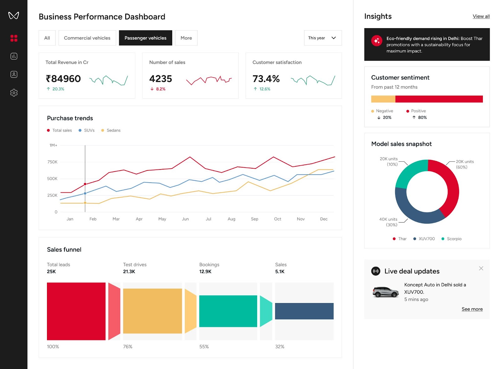
In the modern business environment, data has become one of the most valuable resources a company can possess. Businesses collect information about customers, sales, employees, marketing campaigns, finances and operations every day. Yet having access to enormous amounts of data does not automatically mean a business understands what that data is telling it.
The difference often comes down to presentation.
As a senior business analyst, I have sat through numerous boardroom meetings where sophisticated data models, carefully calculated metrics and technically impressive reports failed to make the expected impact. The problem was rarely the mathematics. The numbers were accurate. The formulas worked. The underlying model was sound.
The problem was that nobody could quickly understand what they were looking at.

This is one of the most important lessons for anyone working with Power BI today: data accuracy is only half of the job. Communication is the other half.
A dashboard can contain perfect data and still be a poor business tool if executives have to spend several minutes searching for the information they need.
That is why some of the strongest Power BI developers are beginning to think beyond DAX, data models and relationships. They are thinking like UI/UX designers.
They understand that a dashboard is not simply a collection of charts. It is an interface through which a person interacts with information.
And that brings us to one of the simplest but most powerful principles in dashboard design: the 5-Second Dashboard Rule.
What Is the 5-Second Dashboard Rule?
The principle is straightforward.
When a user opens a dashboard, they should be able to understand its main purpose and identify the most important information within approximately five seconds.
They should immediately have an idea of what the dashboard is about, whether performance is positive or negative, which metrics require attention and where they should look next.
This does not mean that every detail needs to be understood in five seconds. Complex analysis will naturally require deeper exploration.
The first five seconds, however, should provide orientation.
Imagine a sales manager opening a monthly sales dashboard. The manager should not have to search through multiple charts to discover total revenue, sales performance against target or the region responsible for a major decline.
If the most important information is buried underneath decorative graphics, unnecessary tables and poorly arranged visuals, the dashboard is creating friction rather than solving a problem.
Business leaders are busy. They are not opening dashboards because they want to solve visual puzzles. They want information that can help them make decisions.
The job of the dashboard is therefore to reduce the distance between a question and an answer.
Why Power BI Developers Need a UI/UX Mindset
Power BI development has traditionally been associated with technical skills.
Professionals are expected to understand data transformation, data modelling, relationships, DAX calculations, Power Query and other technical components. These skills remain essential, but the final product is ultimately consumed by a human being.
That human being may not understand DAX.
They may not care how complicated the data model is.
They care whether the dashboard answers their questions.
This is where UI/UX thinking becomes extremely valuable.
UI, or user interface, concerns how the dashboard looks and how users interact with it. UX, or user experience, concerns how easily users can understand and navigate the information.
A technically brilliant dashboard can therefore still provide a poor user experience.
The best developers recognize that the person using the dashboard should influence how it is designed from the beginning.
Reduce Cognitive Load
One of the most important concepts in UI/UX design is cognitive load.
Cognitive load refers to the mental effort required to process information.
A dashboard with too many colours, charts, numbers, buttons and competing elements forces the user to work harder to understand the information.
This is particularly dangerous in business intelligence because decision-makers are often looking at dashboards while dealing with multiple other responsibilities.
A page containing 20 visuals may demonstrate that the developer knows how to create different charts, but it does not necessarily demonstrate good dashboard design.
Sometimes, the strongest design decision is removing a visual.
Ask yourself: Does this chart help the user make a decision? Does it answer an important business question? Does it provide context that another visual does not?
If the answer is no, it may not belong on the page.
According to DDM News, one of the defining qualities of effective business intelligence professionals will be their ability to turn complex information into simple, understandable business stories.
Design for the End User
Another common mistake is designing dashboards for the developer rather than the person who will actually use them.
A developer may understand a complicated matrix because they know where the data came from and why every column exists.
The executive using the dashboard may not.
This is why understanding the audience should come before designing the report.
A marketing executive may care about conversion rates, customer acquisition costs, campaign performance and trends.
A finance director may care about revenue, expenses, margins, forecasts and variances.
An operations manager may want to see productivity, inventory levels, delays and operational performance.
The same dataset can therefore require completely different dashboard experiences depending on who is using it.
Good UI/UX design requires empathy.
Put yourself in the user’s position and ask: “If I were seeing this dashboard for the first time, what would I want to know immediately?”
That question alone can dramatically improve a report.
Build a Clear Visual Hierarchy
Where you place information matters.
People naturally scan a screen rather than reading every element in sequence. A strong dashboard takes advantage of this behaviour by establishing a clear visual hierarchy.
The most important KPIs should generally receive prominent placement.
For many dashboard layouts, the upper section of the page can be used for high-level metrics such as revenue, profit, sales volume, conversion rate or performance against target.
Supporting charts can then provide explanations.
For example, if total sales have declined, the next visual might show sales by region. Another could show monthly trends. A further breakdown might identify the products responsible for the change.
This creates a narrative.
First, the user sees what happened.
Then they discover where it happened.
Finally, they can investigate why it happened.
That is considerably more useful than placing unrelated charts next to one another.
Use Colour as a Communication Tool
Colour should not be used simply because it makes a dashboard look attractive.
It should communicate meaning.
A restrained colour palette usually produces a more professional result than using every available colour.
Neutral backgrounds and consistent colours can make the report easier to scan, while stronger colours can be reserved for important exceptions.
For example, a consistent red may indicate a negative variance, while green may indicate that a target has been achieved.
The important thing is consistency.
If red means “poor performance” on one page but represents “sales from Lagos” on another, the user has to stop and interpret the colour each time.
Good dashboards establish visual conventions and maintain them.
Make Navigation Obvious
Interactivity is one of Power BI’s strengths, but adding interactive features does not automatically create a better user experience.
Drill-throughs, bookmarks, tooltips and navigation buttons can be extremely useful, but users need to understand that these features exist.
A beautifully designed dashboard that hides its navigation options can still be frustrating.
Buttons should look like buttons. Labels should be clear. Navigation should feel predictable.
If a user needs instructions every time they want to move between pages, the interface may need improvement.
The objective is simple: the dashboard should guide the user rather than make the user guess.
Avoid Common Dashboard Design Mistakes
One of the most common mistakes is overusing pie charts.
Pie charts can work well when comparing a small number of categories, but once there are many segments, interpretation becomes difficult. In many situations, a simple bar chart provides a much clearer comparison.
Another mistake is ignoring whitespace.
Some developers try to fill every available space with a chart, table or KPI. But empty space is not wasted space.
Whitespace gives visual elements room to breathe. It separates different sections and makes the dashboard easier to scan.
A third mistake is presenting numbers without context.
Suppose a dashboard shows ₦100 million in sales.
Is that good?
The number alone cannot answer the question.
If the target was ₦80 million, it represents strong performance. If the target was ₦150 million, the same number tells a completely different story.
Context transforms data into insight.
Compare performance against targets, previous periods, forecasts or benchmarks whenever appropriate.
The Future Power BI Developer Is More Than a Developer
The business intelligence profession is evolving.
Companies increasingly need people who can bridge the gap between technical data systems and business decision-making.
That means the strongest Power BI professionals will not necessarily be those who can write the most complicated DAX formula. They will be the people who can combine technical competence with communication, design thinking and business understanding.
If you want to improve your Power BI skills, study more than Power BI.
Study websites.
Study mobile applications.
Pay attention to typography, spacing, colour, navigation and the way information is presented.
Ask yourself why certain interfaces feel effortless while others feel confusing.
Then bring those lessons into your dashboards.
The goal is not to turn every Power BI developer into a professional graphic designer. It is to teach data professionals how to think about the person on the other side of the screen.
Because ultimately, a dashboard is not built for the database.
It is not built for the DAX formula.
It is not even built for the developer.
It is built for the decision-maker.
And if that decision-maker can open your report, understand the central message within seconds and immediately know where to focus, you have achieved something far more valuable than technical complexity.
You have created a business intelligence product that communicates.
That is the real power of the 5-Second Dashboard Rule.
In an increasingly data-driven economy, the professionals who can transform complicated information into simple, intuitive and actionable experiences will have a significant advantage. DDM News believes that as organizations continue to depend on data for critical decisions, Power BI developers who combine technical expertise with UI/UX thinking will become increasingly valuable.
The future of dashboard development is therefore not just about making reports more powerful.
It is about making them easier to understand.
Build the model. Understand the business. Design for the human. Then let the data tell the story.